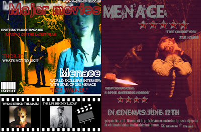
I think using an object such as a knife to link the texts together is a good way of enticing the audience. Knifes are normally associated with cooking in everyday life but in a horror film it's associated with violence and gore which can often cause the audience to want to go see the film advertised.
The purpose of the ancillary texts were to support and promote my main product. Posters are a type of advertisement which you will see in towns up on walls, near bus stops, on buses and on signs. The film companies pay to create these posters and pay to get them put up everywhere. This is so the public are aware that the film is available to see and the posters normally exaggerate and try to attract the audience wherever and however possible. This may mean they put up the best reviews from critics or put up their famous star actor/actress in big bold letters. However for a film to be featured in a magazine isn't advertisement, it is publicity. The film companies do not pay to be featured in the magazine, they are merely in there because the magazine company has heard of the film, has watched it and has liked what they have seen. This causes a positive spiral of people talking about the film and therefore more people going to see it. All films which are profit motivated would love to be featured in a magazine.
My magazine and poster link due to the fact they both have the same characters in the photo and the same setting. Sometimes magazines use the same photo as the poster on their front cover but I think this takes away the effectiveness of the poster and damages the publicity. I've used different colours for the magazine cover to make it more creative and colourful, a magazine cover should be bright and eyecatching whereas the poster should always have a big title but an insightful image, in this case the image is fairly disturbing and this could entice the public well and truly. I feel that my layouts' for both of my texts are in good shape and that they would read well if put into local towns however I think I could have edited my magazine front cover so that it linked more to my poster as some people may not be in my way of thinking, and prefer the photos to have the same type of editing e.g. same colour and same effects. I like my use of fonts, I believe they suit well to their purpose and are clear to the audience. Due to peer feedback I can see that both my ancillary texts have obtained a dominant reading and I am proud of my products.


No comments:
Post a Comment