Monday, 2 May 2011

What have you learned from your audience feedback?

Early footage screening
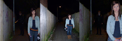
I had a two-staged approach to audience feedback. Firstly I screened some early footage of our trailer to the class. The students in my class gave me some feedback on different aspects of my trailer. The majority of the class thought that my early footage clips weren't suitable for the horror genre as they were filmed in the light. However they thought that my setting in a field with windy, slightly rainy weather was good. Most students thought that the Mise en Scene was over-all good. My main character at this point was a girl, with pale make-up on and a white dress. From the audience's feedback I gathered that they thought this was a good start and that my character could develop immensely if the right setting was put together accordingly, although they did think that a male character would fit better for being the "evil" character in a horror. I took this idea into account and started to develop my ideas. The class thought my storyline was ok and could be developed to become much more horror genre-like, but as this was early days I took this as constructive criticism. On the whole, the class thought my starting plan was a good one but wasn't great. This didn't come as a shock to me as I was a complete beginner in film making and took all of their feedback into consideration and decided to change my plan completely and to change the story into one I thought would fit the horror genre and please the audience much more than my original idea. My main "evil" character changed to a man around the age of 35 and I introduced another character which would be the "victim", a young girl. The setting changed to a dark, eerie alleyway and then the trailer would continue on into the house of the victim. This first screening really helped me to see what the audience wanted from a horror trailer and facilitated the development of my narrative and characterization. Even though my feedback wasn't postive, short-term wise, the impact was positive long-term as it gave me a chance to re-think my ideas and come up with better ones.

Completed trailer screening  
When I felt I had completed the trailer, I showed it to another audience. 4 people to be exact, 2 of which were in the age slot of our target audience, and 2 of which weren't. I expected their reactions to be very different to one anothers as the age difference has an impact on how you take in certain media texts, especially a horror film trailer as it depends very much on what the audience finds scary. I gave them each a questionnaire to fill out when they had watched the screening. (Questionnaire is on the blog) This questionnaire wasn't only to find out if my trailer was a success, it was to find out if my target audience in particular, decoded a preffered reading to my main media text and I had suceeded at my job as an encoder too. This feedback also helped me to find correlations between social stratification and reaction to the trailer. 
The results were fantastic, my target audience feedback came out mostly preferred with my non target audience feedback coming back mostly aberrant. This was expected and helped me to see that I had succeeded in creating a trailer for a particular audience.

People react to media texts in different and sometimes unpredictable ways. I made sure my final trailer screening was done in a darkened room so that my trailer could be watched with full effect. However, if the trailer was watched in a different condition it may change the typical gratification a person might get from watching the video. Sometimes, giving your audience a questionnaire to do before a screening can cause them to feel differently about it and cause their original thoughts of the trailer to change without them noticing. I took this into account and gave my audience the questionnaire after they had watched the trailer. This ensured their original readings of my media texts weren't interferred with and the feedback I gained was completely accurate.

Overall, audience feedback, particularly the early screening, helped me to form my ideas and helped me to develop my trailer so it was of a standard which was accepted and thought of as good by my target audience. In a way, audience feedback helped me to create my trailer as it initiated the change of plan.


Final trailer screening 1 - non target audience

I devised a small questionnaire and showed my final film trailer to two people, one male and one female, both of which are over the age of 40. Now since this age is not one of our target audience I hope to see a slight difference in the answers given when compared to the answers given by the people I give it to who are in our target audience age slot.

Questionnaire:

Do you think the effects we have applied to the clips are effective?
Very effective 1                  2                   3                  4  Not effective     
 
Do you think the music fits in well with the scenes?
Fits very well 1                  2                   3                  4  Doesn't fit

Do you think the ending of the trailer is effective?
Very effective 1                  2                   3                  4  Not effective

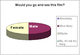
Would you go and see this film?
 Absolutely 1                  2                   3                  4  No, it's not my thing

What age certificate do you think this film has?

U(universal)          PG(parental guidance)          12A(12 with adult)          15(over 15)          18(over 18)


These were the outcomes, remembering this showing was to an audience which was way out of our target audience area:


Final trailer screening 2- target audience

I devised a small questionnaire and showed my final film trailer to two people, one male and one female, both of which are aged 18. Now since this age is one of our target audience I hope to see a slight difference in the answers given when compared to the answers given by the people I give it to who are not in our target audience age slot.

Questionnaire:

Do you think the effects we have applied to the clips are effective?
Very effective 1                  2                   3                  4  Not effective    
 
Do you think the music fits in well with the scenes?
Fits very well 1                  2                   3                  4  Doesn't fit

Do you think the ending of the trailer is effective?
Very effective 1                  2                   3                  4  Not effective
Would you go and see this film?
 Absolutely 1                  2                   3                  4  No, it's not my thing

What age certificate do you think this film has?

U(universal)          PG(parental guidance)          12A(12 with adult)          15(over 15)          18(over 18)


These were the outcomes:


In what ways does your media product use, develop or challenge forms and conventions of real media products?

The majority of media texts have what we call Generic Textual Features. These include:
  • Narrative- similar plots and structures, predictable situations, sequences, episodes, obstacles, conflicts and resolutions
  • Characterization - similar types of characters, roles, personal qualities, motivations, goals, behaviour
  • Basic themes- topics, subject matter
  • Setting- geographical and historical
  • Iconography- a familiar stock of images or motifs, the connotations of which have become fixed; primarily but not necessarily visual, including decor, costume and objects, certain 'typecast' performers, familiar patterns of dialogue
My main product and my ancillary texts will use, develop and challenge these codes and conventions (Generic textual features) of media texts.

My main product, which is my film trailer, has a similar narrative to most horror films. I hope to have portrayed this with the clips in the trailer without having given away too much of the story. The basic storyline is that a psycho has his eyes on a young girl and he then sneaks into her house to attempt a murder. The solution is not revealed in the trailer but going along with a narrative thats similar to existing films the solution is that the victim "beats" the psycho at his own game and there is a happy(ish) ending. The characters are similar and have analogous roles with personal qualities that you may be able to identify in existing horror films. With the young girl victim, and the older man "psycho", this film fits in very well with many narratives and themes of other films such as:

These narratives and themes seem to go down well according to the reaction of films such as prom night and audience's like the theme of girl victim and man psycho. If there was a woman psycho, the effect wouldnt be the same. However, I have developed the characterization generic textual feature and expanded the male psycho character into one that is paranormal. I think this will be exceptionally effective as the thought of him being physically dangerous (using a knife etc) will be ignited with the thought of him being paranormal too. According to my audience feedback, the paranormal is something a majoirty people are afraid of because it is unknown whether these things are true or not. In this sense my trailer does challenge some forms and conventions of real media products as the story differs and therefore has a slightly different storyline to most existing films. The setting of my trailer is very similar to real media products that exist already. It is set in a dark alleyway at first, and then continues on inside a small house where various paranormal activity goes on and where the 'menace' will sneak in. The setting is mostly dark or edited to make seem more eerie and to have an extra tense atmosphere. My main product doesn't necessarily challenge or develop any forms of real media products in the sense of setting, but uses many of them. Iconography wise, my trailer develops some aspects of real media products. In my trailer I have a scene of complete darkness but I have added a voice over of someone crying and pleading for someone to leave them alone. I think that this is a good feature to have in a horror trailer as darkness is something that is known to scare people, and with the added voiceover of a victim, this could increase the tensity that this scene may have already had. A familiar prop that I used was a knife. This fits in and uses forms and conventions of real media products, an example of an existing film using a knife is Child's Play.
My trailer uses codes and conventions of trailers. Our trailer starts off with a dark shot of the victim walking, but we have edited it so it flashes into negative at two points during this scene. This is similar to the paranormal activity trailer that i've researched in my Codes and conventions. The background music that i've used is also chilling, yet fairly quiet at the beginning as sometimes silence and quiet noises can be the scariest when used at the right points in a trailer. By building up the tension with the background music, the images seem much more effective. We also start our trailer off with the company name that produced the film, this happens in all trailers at some point. Another textual feature we used was the use of text throughout the trailer to explain some background information and to get the audience thinking about our film. An example of this is "Who will be next?" could get the audience thinking and wanting to know what happens in the rest of the film. Like in the trailer for Insidious, we continue the trailer with shots from the film and flashing images with a tense background soundtrack.

How did you use media technologies in the construction and research, planning and evaluation stages?

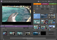
During my research stage I mainly used the internet to look up different things. A well known website I used was youtube .  I used youtube to find and watch existing film trailers and this helped me to understand the types of features a film trailer has. Actually being able to watch film trailers helped me a lot because it gave me inspiration and ideas for my own trailer whereas without this site it would have taken a lot longer to come up with ideas. I also used iTunes to research different soundtracks that went with existing film. I looked at the avatar album and then also found some other various soundtracks through searching around this software. Using iTunes gave me ideas for what music I would use for my trailer as I was able to hear what types of music existing horror/scifi/thriller films/etc had used. I also used the internet to research magazine covers and posters using google images. Lastly I used microsoft word to produce a questionnaire which I then handed out to people within our target audience age and this helped me to understand what the target audience thought about various things within a horror trailer. This helped me and my team to understand what aspects to put into the trailer and which things not to put in. During my planning stage I used various technologies for each of my products. For my main product is was mostly using the film camera and using the editing software which was Premiere Elements.8 and it looks like this:
 

It took time getting used to the film camera and so we made a practice film with it so we could learn how all the features on the camera worked, we then edited this film using Premier Elements.8 so we had a trial run of how to use this software too. Using the film camera to help plan our trailer was really useful as we could test out our ideas and see how they would turn out on the camera. It also gave us a chance to see how well the camera worked in different lights and helped us to plan our different trailer shots. However, using the film camera did have it's limitations, sometimes camera files would strangely go missing when uploaded to the computer or some files from the camera would not upload to the computer and so sometimes we had to film them again which was fairly frustrating for my team as it was very time consuming. Using Premier Elements.8 to help plan our trailer was a really easy way of seeing what effects we could add to the different shots and helped us to really picture how our trailer was going to pan out. However there were also some limitations when using this software, as we were beginners with this software we had to have a lot of help from our teacher and couldnt get on with using this software at times without being in a lesson with them. Another limitation with this software was that it kept crashing and deleting some files we used in trailer. This was extremely wearisome and we got very frustrated with the software as it was losing us valuable time,
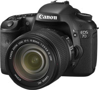
unneccessarily. Two technologies I used to help me plan and construct my ancillary texts was photoshop and a Canon EOS 7D (camera). I have used photoshop many times before and so there weren't many limitations on using this software. Having photoshop available at home really helped my planning and construction as I could edit my photos for my magazine cover and poster to see what effects looked really good and what effects affected the audience best. Using photoshop also helped me plan my layouts as I could easily see what looked good and what didnt look right. It also was easy to construct the final product as I had played around with a few photos beforehand and so I knew all the different features of photoshop fairly well. My dad used to be a photographer, so using a big camera like the Canon EOS 7D was fairly easy and he taught me all the different features of it and I was able to do a few mock photoshoots nice and easy to help me see how the camera worked, and then it was very simple to use this camera for my final products. There were no real limiations when using the camera as I had my dad on hand to help me use it. For my evaluation stage, I used an interactive whiteboard to screen some scenes of our trailer and constructed a small questionnaire for some audience feedback. There weren't many limitations with this as it was a quick and easy process apart from it took a few minutes to get the sound working. Lastly I used blogger to contain all my notes and processes for this project, there weren't many limitations to this, it was easy to get used to, however if the internet were to go down and fail, I would not have been able to use blogger.

Early screening questionnaire

When we had filmed our clips for the trailer, we screened them to 10 people and handed out a questionnaire for them to fill out in order for us to gain feedback.

Questionnaire:

1.     Age: Please circle appropriate age range
14-17      18-22      23-28      29+
2.     Gender/Sex: Please circle M F

3.     How often do you go to the cinema?
Twice a week            Once a week            Once a fortnight            Once a month            Rarely            Never
Trailer:
4.     How effectively did you feel the trailer communicated the type of film being promoted?
Circle appropriate number
Very effectively                        1            2            3            4            Not very effectively
5.     How easy was it to understand what film genre the trailer was promoting?
Circle appropriate number
Very easy                        1            2            3            4            Not very easy
6.     How easy was it to understand the basic storyline of the film the trailer was promoting?
Circle appropriate number
Very easy                        1            2            3            4            Not very easy
7.     How effective were the various settings?
Circle appropriate number
Very effective                        1            2            3            4            Not very effective
8.     How effective was the use of music
Circle appropriate number
Very effective                        1            2            3            4            Not very effective
Clips:
9.     How effective was clip 1?
Circle appropriate number
Very effective                        1            2            3            4            Not very effective
10.  How effective was that clip sequence?
Circle appropriate number
Very effective                        1            2            3            4            Not very effective
Using the feedback I created some graphs to make it clear how the answers came out:
Question 1:


Question 2:


Question 3: 

Question 4: 

Question 5:

Question 6:

Question 7:

Question 8: 

Question 9: 


This was expected as the clips are very simple at this time!


Question 10:


Most of the answers that we got were of preferred readings and we were very happy with this. Question 9 didn't come as a shock to us as we understood how simple our clips were at this stage. Hopefully when our trailer is fully finished we will get better feedback for this question.

Thursday, 28 April 2011

How effective is the combination of your main product and ancillary texts?

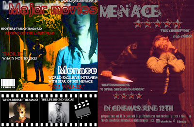
As an encoder, I have produced a horror film trailer, a cover of a magazine featuring the film and a poster to advertise the film. I didn't plan all three of these together. After finishing my trailer, I picked out important key signs that were in the trailer that would help link the ancillary texts and the main product together. These cohesions were the use of a knife, the victim and the killer.


I think using an object such as a knife to link the texts together is a good way of enticing the audience. Knifes are normally associated with cooking in everyday life but in a horror film it's associated with violence and gore which can often cause the audience to want to go see the film advertised.
The purpose of the ancillary texts were to support and promote my main product. Posters are a type of advertisement which you will see in towns up on walls, near bus stops, on buses and on signs. The film companies pay to create these posters and pay to get them put up everywhere. This is so the public are aware that the film is available to see and the posters normally exaggerate and try to attract the audience wherever and however possible. This may mean they put up the best reviews from critics or put up their famous star actor/actress in big bold letters. However for a film to be featured in a magazine isn't advertisement, it is publicity. The film companies do not pay to be featured in the magazine, they are merely in there because the magazine company has heard of the film, has watched it and has liked what they have seen. This causes a positive spiral of people talking about the film and therefore more people going to see it. All films which are profit motivated would love to be featured in a magazine.

My magazine and poster link due to the fact they both have the same characters in the photo and the same setting. Sometimes magazines use the same photo as the poster on their front cover but I think this takes away the effectiveness of the poster and damages the publicity. I've used different colours for the magazine cover to make it more creative and colourful, a magazine cover should be bright and eyecatching whereas the poster should always have a big title but an insightful image, in this case the image is fairly disturbing and this could entice the public well and truly. I feel that my layouts' for both of my texts are in good shape and that they would read well if put into local towns however I think I could have edited my magazine front cover so that it linked more to my poster as some people may not be in my way of thinking, and prefer the photos to have the same type of editing e.g. same colour and same effects. I like my use of fonts, I believe they suit well to their purpose and are clear to the audience. Due to peer feedback I can see that both my ancillary texts have obtained a dominant reading and I am proud of my products.

Wednesday, 27 April 2011

Magazine cover

I used photoshop to create my magazine cover:

Again, I used a photo from my photoshoot and I changed the colours using Adobe Photoshop. I thought these colours were particularly effective as it contrasts from the "major movies" title and I thought that the colours I chose to highlight the main character (victim, girl) to make her stand out and show the audience that she is the main character in this film.
Similar to my poster, I used Da Fonts.com for my font. My font is called Dirty Play and I used it because it's bold, it's clear to read, it stands out and is the type of font a film magazine would use.


I thought the layout I have chosen is effective and according to my peer feedback, they also think the layout I chose is good, practical, stands out and you can immediately point out that this magazine is going to be about films because of the iconography I have used (the film strip that holds images at the bottom and a scene-cut board). The background image is one from my photoshoot but i've edited it and changed the colours to colours I believe would stand out on a magazine cover. The smaller images I have used are ones I found from Google Images. I didn't use my own original photos because I couldn't find any that suited the purpose of "side stories".

Tuesday, 26 April 2011

Codes and Conventions

Magazine
  • Image of celebrity
  • Puffs
  • Plugs
  • Magazine title
  • Barcode
  • Issue date
  • Website


Poster
  • Title of film
  • Tagline
  • Image
  • "starring..."/actors name
  • Release date of the film
  • Reviews (4 stars, 5 stars, etc)
  • Website
  • Film details in thin, condensed text
  • Quotes from reviews


What are the key generic features of a trailer?

I watched some trailers and here are some features and aspects that I noted down:

Horror trailers
Paranormal activity 2 -
  1. Starts off with some editing of a blank, black shot with some background noise
  2. Then a quick, jumpy, action shot of someone being thrown at the camera
  3. It then has a pause in the action and slows down, some text is displayed to build up the release of the new film
  4. Some shots are shown from the film
  5. No background music to create an eerie atmosphere
Isidious -
  1. Starts off with company name/logo
  2. Then shows the title of the film with some strange background noises
  3. Then starts with the shots from the film and some dialogue to introduce the audience to characters?
  4. "From the makers of paranormal activity and Saw" promotes the film to audience who may have liked these films
  5. It then continues with a tense background soundtrack and cut shots from the film
Romance trailers
Charlie st cloud -
  1. Starts with the universal logo and some happy acoustic music
  2. image of setting
  3. Dialogue from the film
  4. More images and shots from the film
  5. Happy music throughout


Life as we know it -
  1. Immediately starts with shots from the film and a up-going beat
  2. Logo of warner bro.s pictures
  3. Carrys on with dialogue and images from the film to introduce audience to storyline
  4. Text comes up to explain what's happening
Comedy trailers
Hangover-
  1. Starts with dialogue from film to introduce
  2. Chart music song
  3. Sped up shots from film
  4. Main storyline


What are the key generic features of your chosen genre?

My chosen genre is horror/thriller. There are many key generic features that makes a film a horror/thriller. Negativity is a main one. Something negative always happens in a horror whether it be a gruesome death or a ghost haunting. A majority of horror movies follow the same style of narrative.

It starts off with a balance. Everything is normal until there is some sort of disturbance, a murder perhaps, the film then carries on with the disturbance, normally this gets worse throughout time until a resolution is found and the balance is found again to end the film. This doesn't necessarily mean a happy ending though.


In most horror and thriller trailers they have sudden close ups, fast action cut shots and long, dark shots to create an eery atmosphere. This builds up tension and engages the audience.

Characters in a horror
The typical characters are:
1 main 'good' character or a 'good' group
1 main 'evil' character or an 'evil' group
A male hero
A female victim

Settings and props in a horror
A Haunted house for example a majority of the filming in 'The Grudge' - 2004


Another possible setting is an enclosed space e.g an alleyway or a town for example in 'The Crazies' - 2010


Another possibility is an abandoned public place such as an old hospital or mental asylum for example in 'Boo'-2009 


Props used are; knives or weaponry, fake blood and dark clothing for a killer or white clothing for a ghost.

Thursday, 21 April 2011

Poster

I've decided the best photo for my poster in particular is one that illustrates the horror in the film. Therefore I have chosen an action shot:

I experimented with my chosen image using Adobe Photoshop.

I then went on http://www.dafont.com/ and looked at different fonts I could use for my poster


Final poster:

Saturday, 16 April 2011

Photoshoot

I carried out a photo shoot in order to start the process of the poster and magazine cover which would complete my coursework package.

I started out by experiementing with position. I took mock photos of me standing in different places and moving the camera to see which positioning worked out best:


I then took photos without the flash on to see what they came out like and used a torch to highlight my face:


I then started experimenting with lighting and colour (keeping in mind that it would later be edited):


I then experimented with different types of shots. I took photos of different action shots using close ups and mid shots.


Thursday, 24 March 2011

Types of Cinema

There are 3 types of cinema:
first cinema
second cinema
third cinema

First cinema
First cinema is normally referred to as Hollywood. These are mainstream films that have a huge budget and are shown in multi-screen cinemas. These are normally the most popular films that you'll see in adverts on tv and see posters up on bus stops. Examples of these films are:

Twilight                           
Avatar


These are called high concept films. They use a lot of special effects and include many decontextualised action sequences. After the release of the film, many high concept films create merchandise to earn extra profit. This happens especially if the film is aimed at children as they are more likely to purchase toys and games. First cinema/high concept films are profit motivated and have mass audiences. Warner Bros, Universal and Paramount are examples of companies in this sector.

Second cinema
Second cinema is politically or art motivated and are normally created by "Auteurs" who create films and 'leave their mark on it'. An example of a director who does this is M. Night Shyamalan.

Second cinema rejects hollywood conventions but is based on the individual expression of the Auteur director.

Third cinema
Third cinema is politically motivated. Third cinema films aren't usually shown in multi-screen cinemas and are films based on truth, religion and are mostly created by directors in less developed countries such as Sub-Saharah Africa.

Guelwaar
Third cinema rejects the second cinema view that films are a vehicle for personal expression, and prefers to express many peoples opinion on a particular issue, for example in Guelwaar it's on a religious issue. Third cinema films are created to express a particular truth or to express peoples beliefs in a certain matter. They aren't big budget, normally have an extremely low budget and are generally of poor quality due to the conditions and economic issues in LDCs (less developed countries). These films aren't normally shown in cinemas outside of the country it was made in.

Tuesday, 15 March 2011

Film Magazines

I found some film magazines and have explained what I like about each of them.

Empire Magazine
I really like this front cover as the image is very striking. The use of editing within this image has created an action packed front cover, introducing us to all of the stars in the film. Most people are attracted to a film when a star that they like plays in it. I also like the use of the film strip at the bottom of the cover which features what will be in the magazine. This is a very clever way to keep in with the theme of movies and to make the cover more exciting. I may take this idea and use it in my own magazine.

SFX magazine
I think that this particular cover of SFX is good. The title of the film is bold and glowing, which is instantly charming for the reader. I like the colour use, yellow and blue really stand out with eachother and it fits in with the genre of the movie (sci-fi). I will use this idea in my own magazine cover, choosing colours to fit the genre so that the audience can immediately work out which genre of film the magazine mainly features.